I Castelli Restaurant
Alba, Italy
Type: Expansion
Area: 1.000 sqm
Completion: 2013
Images: Archicura
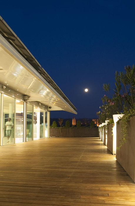
The project involves the construction of a new restaurant on the roof-terrace of the hotel “I Castelli” in Alba. The building on which we had to “insist” is a creation of the late ’80s, whose volume and materiality represent a declaration with which, by their very nature, it was not so easy to talk with. In addition there were already several elements, not related to each other, emerged in different stages of life the hotel itself. First of all, some brick “towers”, compact and rigid, containing the outlets of all the hotel facilities (these elements are present from the first draft of the project), and secondly a metal structure, consisting of a large circular columns supporting curved truss lightened by holes (2005/2006), made both to cover the space, both for supporting of solar panels.
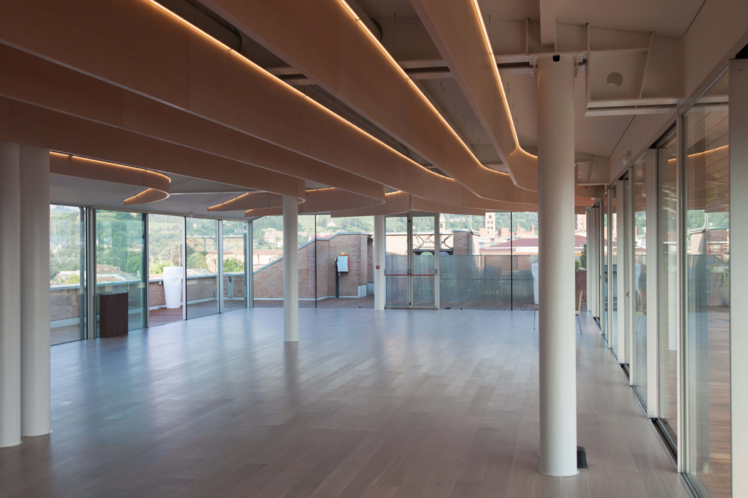
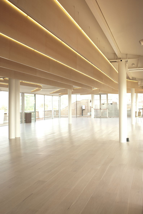
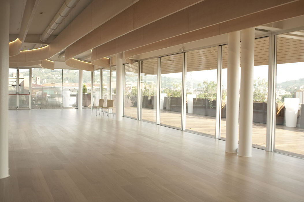
Around these elements we had to create a fluid, functional, light and airy space, split in half between the areas for customers and those for kitchens and accessories. Despite the presence of “obstacles” the space should have result as free and open as possible.
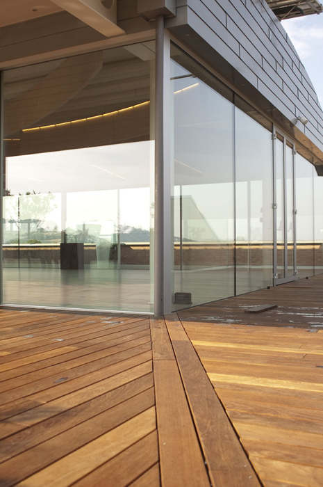
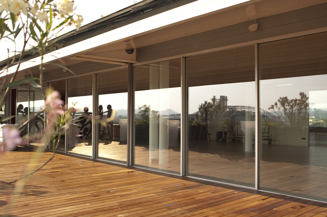
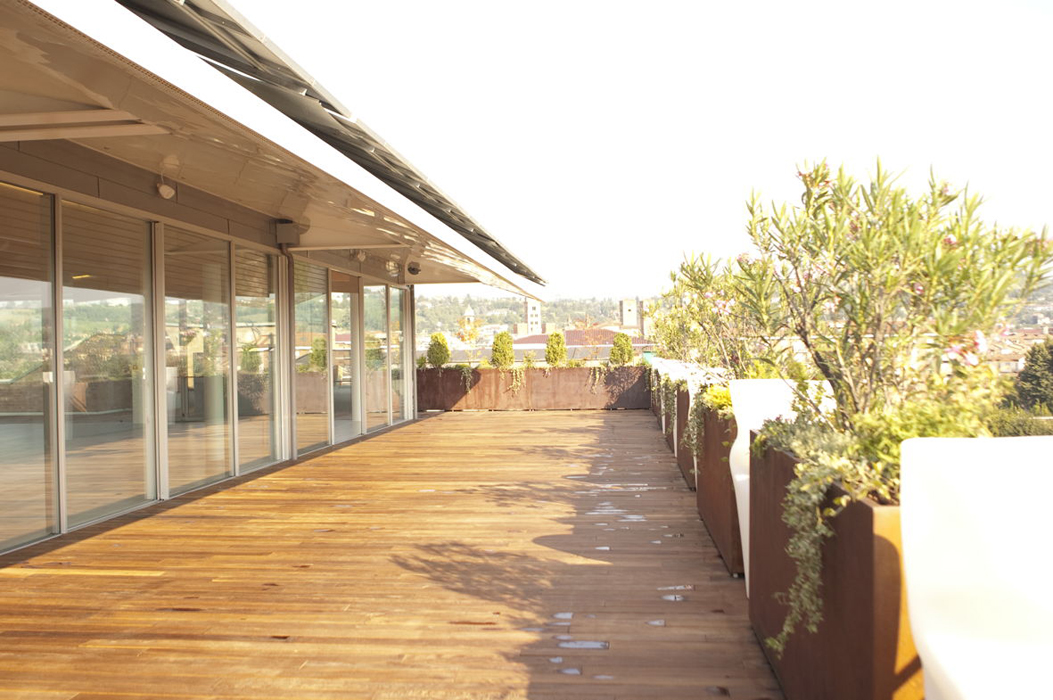
With these premises, was born a volume fully plugged under the existing roof. The volume, although formally one element is, in reality, composed by two “souls”: that of amusement, transparent and light that has been made with three long glass walls, and that of the preparation, which is represented with three walls completely covered with sheets of zinc-titanium.
Internally, the two souls are divided by a corridor that starts from the existing stairwell and reaches up to the window and then opens directly onto the terrace.
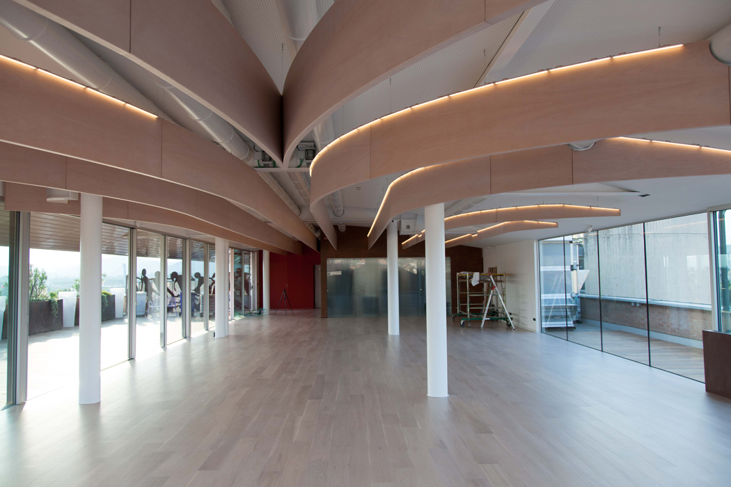
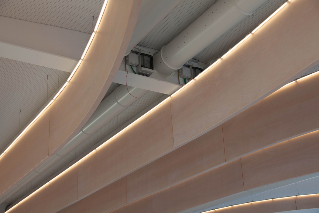
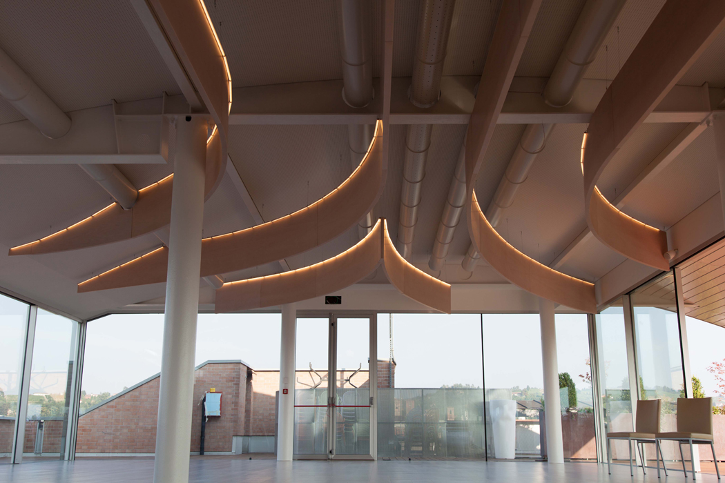
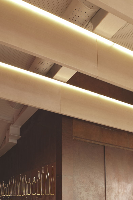
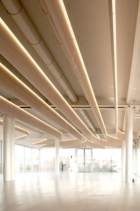
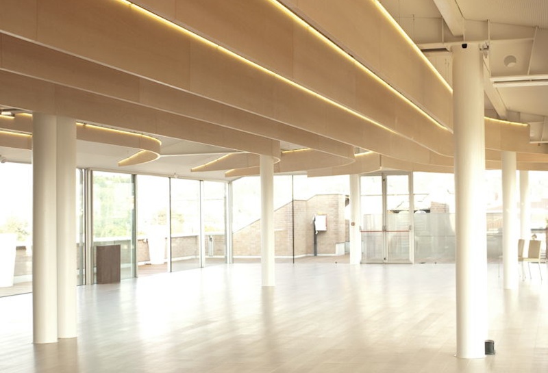
One of the key ideas of the project was to keep the ducts completely visible and then to create an entirely new and different element that, using the ducts curves and forms as a starting point, will almost completely detache from them so to attract the attention, hiding what there is above, but gently. Thus were born the blades: a soft sign that descends from the ceiling, which accompanies the ducts but it has gone away, taking the sinuous movements of the rows of the vineyards .
So the public space is characterized by these smooth wooden curves hanging from the ceiling and that, after all, emphasize, in a diaphanous way, all the existing structure, completely painted in white, and the new ducst, also completely white. The visual and sensory experience is very special, and materials (wood on the ground and on the blades, white on structures and walls) soften and create a unique comfort throughout the whole room.
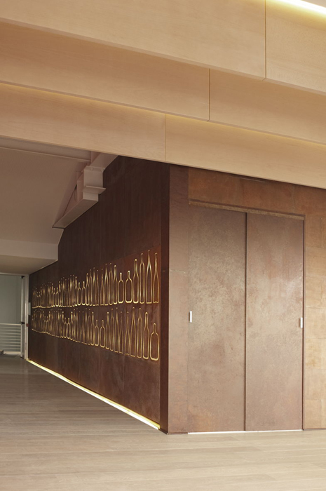
The game of the alternation of curves and materials (wood and white paint) is perceived across the hall, to the point at which a volume of corten comes off and emerges. The corten, while having very different characteristics and while coating a body that does not have curves, however, does not intervene on the soft atmosphere of the environment.
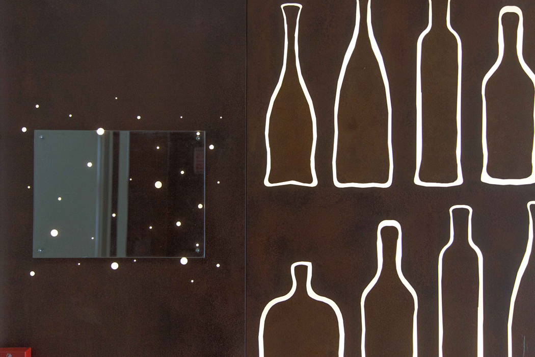
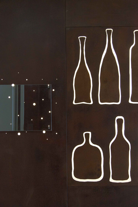
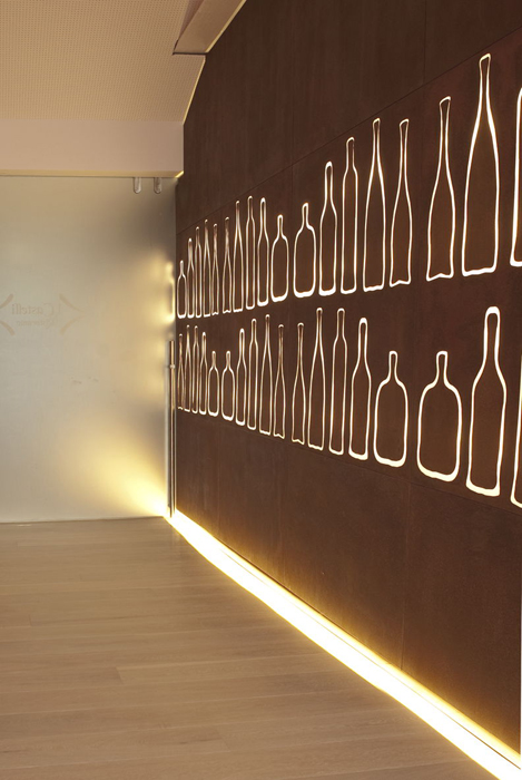
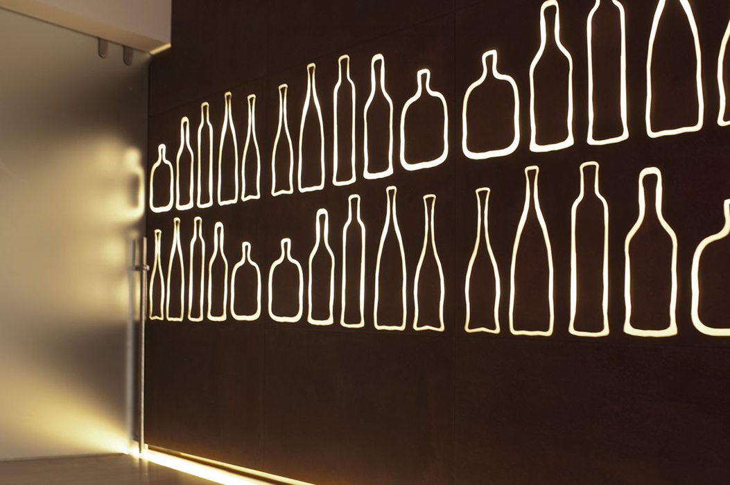
The volume contains the buffet furniture, ready to appear and disappear at every opportunity. The corten, from the main hall, turns in the hallway, making the headway to a series of playful elements that punctuate the space, both internally and externally. In the corridor, as a matter of fact, silhouettes of bottles of different shapes and sizes have been obtained in the very sheets of the corten covering.
Backlit, playful and smiling.
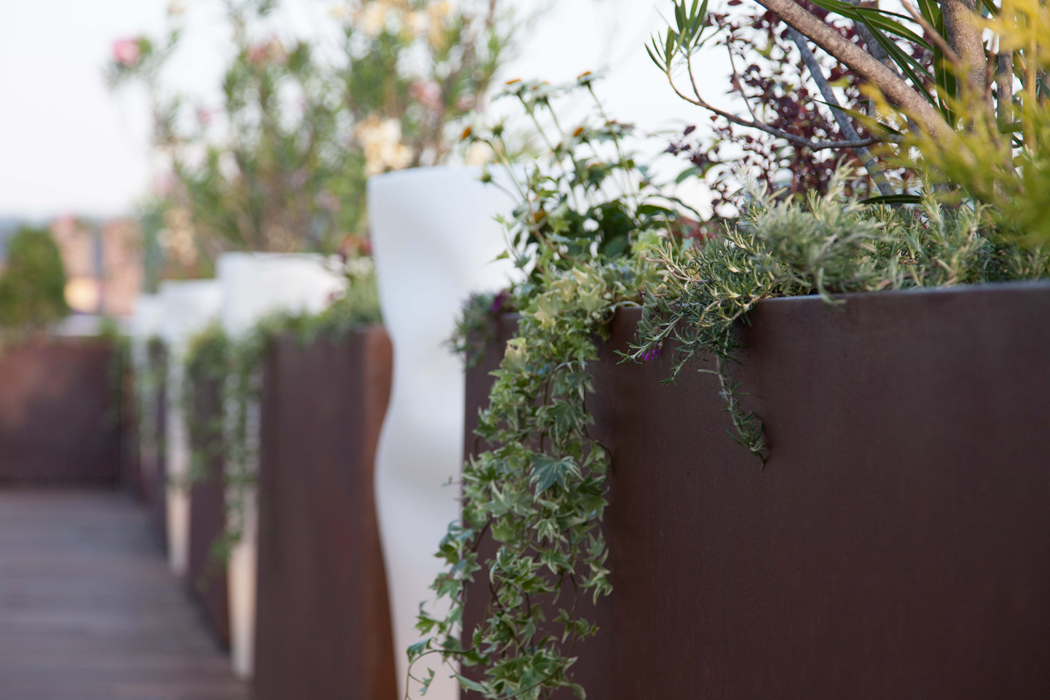
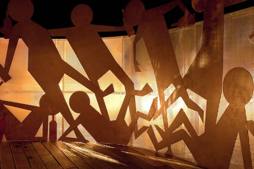
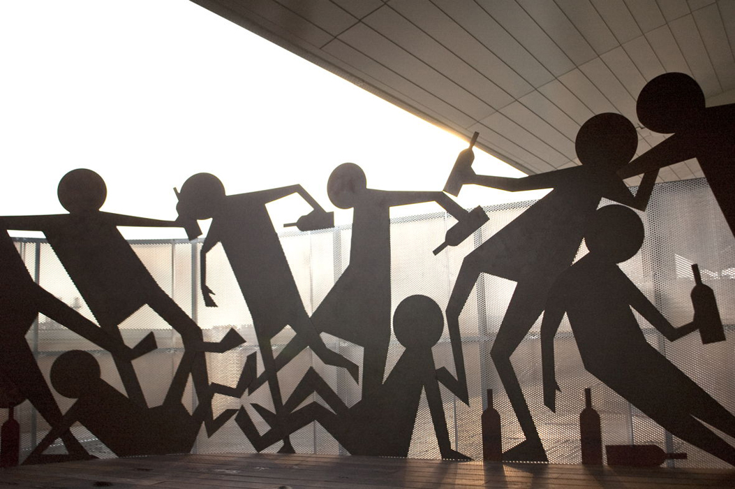
As well as playful and light-hearted is the corten on the terrace: from slab carved the corridor it turns into shape … but what a shape! A number of men and bottles, straight and crooked, large and small decorating the metal grids necessary to define and cover the space: the “drunken”, light-hearted but not excessive, scattered in the open air, to gaze the view from the top!
Particular attention was placed on lighting: in the room, thanks to long strips of LEDs, accompanies the blades accentuating the forms, while, when the LEDs are associated with the corten, they emphasize and enhance the non puckish character of objects.

